Friday, 19 September 2008
Two weeks in the colourful world of Grey
Working within advertising is something that has always interested me and I recently just finished two weeks work experience at Grey London. I had the pleasure to work with the type and design team and even experience the free bar.
Grey is located in Farringdon and has an impressive glass front to the building where they alternate displays of their recent campaigns. The office is split on different levels where departments are intermingled relating to their 'open process' of working.
During my two weeks I was working on two live projects which involved coming up with some graphics to represent Grey along with branding and renaming a charity. It was great to see how the different departments pull together and how the structure of the company works.
I had a enjoyable and productive two weeks and got to work with some great designers and creative enthusiastic people. Thank you to every one that helped me throughout the two weeks and that I bugged with a million questions.
Friday, 29 August 2008
Thinking in the box!
Just a little something i heard today that made me smile.
'Put a box around the good ideas so they don't run away'
Curtsy of Frank at Grey London
'Put a box around the good ideas so they don't run away'
Curtsy of Frank at Grey London
Saturday, 16 August 2008
Life at The Sunday Times
Today is my final day at The Sunday Times design department - which is certainly not your average 9 till 5 job (not that any work within the creative industry is). Tues to Saturday starting at 10/11ish with clocking out time getting later as the week goes on and the paper is due to go to press.
On the 5th Floor of News International you will find the maze of desks which contains the design department who put together 'your new Sunday Times'. The redesign of The Sunday Times is still ongoing and has taken advantage of the new full color printing press using hints of color to make navigation through the paper easier and clearer.
Whilst on work experience at The Sunday Times I have learned how the paper is put together and built. Working from the designers through to programmers who rebuild the pages in a programme called Hermes.
I have also had the opportunity to work on the layouts in the sport section and front covers in the Ingear and Culture section. On a rather exciting note one of the Ingear covers I worked on was chosen for this weeks edition!
The last week has been a great experience and I have had the pleasure of working with some lovely people who have answered all my questions and put up with me being their shadow. I have been taught and learned some great tips on editorial design, a few new Photoshop/Indesign tricks along with the role of a designer within a newspaper environment.
A big thank you to every one that helped me.
Friday, 15 August 2008
Font Conference
A little light humor to the subject of typography! Loving the characters given to the fonts - i think my personal favorite is Century Gothic.
Monday, 11 August 2008
Work Experience at The Sunday Times
Tomorrow I will be starting at The Sunday Times for a couple of weeks work experience.
This is a really exciting opportunity for me ... I'm looking forward to discovering how the design process works within the broadsheets.
This will be a new experience for me and very different to my previous work experience at design company Purple Frog.
Now the big question is what to wear ....
Friday, 8 August 2008
Love Me Hate Me : Ravensbourne Degree Show 08
A great end to fabulous three years at Ravensbourne. A really stunning show including Graphic Design, Moving Image and Animation.
A great turn out from both industry, family and friends.
A huge thank you to those involved with all the hard work of putting it all together to create such an enjoyable evening and professional exhibition.
A great turn out from both industry, family and friends.
A huge thank you to those involved with all the hard work of putting it all together to create such an enjoyable evening and professional exhibition.
Thursday, 26 June 2008
RSA Degree Show!
Love me, Hate me.
Ravensbourne Degree Show
Graphic Design, Moving Image and Animation
Private View:10th July 6pm-10pm
Public View: 11th July 10am-4pm
RSA,
Durham House Street
The Strand London
Well its come to the point now that after far too many years in education (all well spent of course) its time to enter the real world and start looking for a job! After a successful exhibition at D&AD New Blood Ravesbourne Graphic Design will be hosting our own show with moving image and animation at the RSA, London.
If you would like to come and see our work please visit our site for further information
http://www.rave.ac.uk/lovemehateme/work.htm
Saturday, 17 May 2008
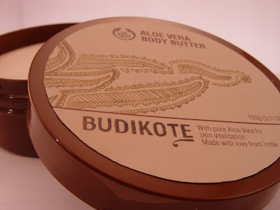
Photo Shoot - BUDIKOTE (Body Shop)
Spent a couple of hours today at the QVC towers in their 'Galaxy' photographing my packaging designs for the Budikote Range. Got to play with a camera, lighting, blue tack and a mixing bowl!
The designs on the packaging are mainly hand drawn reflecting on the ethos of the scheme which involves a community trade project between Budikote (a small village in India) and The Body Shop. The paper stock used is eco friendly and would be printed with vegetable ink.
Sunday, 11 May 2008
(Milk no sugar) My Website
Finally i have the first draft of my website up and running! yeyeyeyey! Its still not complete with some information missing but the basis is there. Featuring recent projects which i have been working on over the past year during my final year at Ravensbourne College of Design and Communication.
For Contact information and a printable version of a selection of my work please down load my cv! Enjoy!
www.gemmabroughton.co.uk
Saturday, 3 May 2008
Honda Banana
"Have you ever written on a banana in biro? Its crazy but it works like a dream. You wish all writing could be this way. It flows. It's smooth. It's sensual. You get the urge to write poems; sonnets; odes to lilies. A strongly worded letter of complaint is impossible. It makes you realise that everything can be improved. That even the familiar can be looked at in a new light. And that imagination is more powerful than knowledge. Do you believe in the power of dreams?"
You know what its true about writing on a banana - you should try. I like this ad as its unusual for the product being sold not to feature as an image in the advertisement. A bold simple idea which is eye catching and intriguing which sells the ethos of a company rather than their product. Building up the strength of the over all brand and giving Honda a strong personality.
Wednesday, 30 April 2008
BBC Four: Gutenberg Press
While I'm on the subject of good t.v. not only has Hero's started again but BBC Four showed a cracking documentary featuring Steven Fry, some old machinery and a lot of type, humor, history and typography - you can't go wrong there.
Stephen Fry and the Gutenberg Press
Stephen Fry examines the story behind the first media entrepreneur, printing press inventor Johann Gutenberg, to find out why he did it and how.
http://www.bbc.co.uk/iplayer/page/item/b009wynj.shtml?q=Stephen+Fry+and+the+Gutenberg+Press&start=1&scope=iplayersearch&go=Find+Programmes&version_pid=b009wy81
BBC Four: Mad Men Season
If you can catch another viewing of either of these two programs that its well worth it. An interesting insight to the history of advertising and how it all started. With frank and honest views from some of the industries legends on the growth, demise and future of advertising business.
David Ogilvy: Original Mad Man
Part of the Mad Men season.
The story of David Ogilvy, whose advertising agency started out in 1948 with no clients and two members of staff and became the largest advertising conglomerate in the world.
In time, this would become the era of the Mad Men, the men of Madison Avenue who worked out of sleek offices, chain-smoked and conjured up the heaven-on-earth vision of suburban consumer splendour.
The documentary reveals Ogilvy's extremes and eccentricities through interviews with individuals whose lives he touched: those who knew him and worked with him during the conception of some of his most famous campaigns.
Past
Present
The Rise and Fall of the Ad Man
...Time Shift
Showing as part of the Mad Men season. Peter York investigates the inside story of British advertising from top British advertising figures past and present, including Alan Parker, David Puttnam, Tim Bell, Frank Lowe and Martin Sorrell.
Inspired by the maverick US advertisers of Madison Avenue, a new generation of British ad men created a unique style of advertising based on authentic British culture. During the 1970s, British ads came to be regarded as the best in the world. But when the business climate changed in the 1980s, the British ad man had to reinvent himself for a new, global market.
Tuesday, 29 April 2008
OGC Logo Blunder
What the logo was meant to do:
The logo, for the Office of Government Commerce, was intended to signify a bold commitment to the body’s aim of “improving value for money by driving up standards and capability in procurement”.
What the logo does do:
I don't think I really need to explain ......
Being a designer I can see how this can happen as your looking at a design for so long you don't even read it as words or letters any more. However I don't understand how a whole office of other creative and non creative people couldn't have spotted this one! It just shows how important it is to run your ideas past others and of course flip it 90 degrees just to check before you send it to print! (well I will be doing so from now on)
O well at least they invented a new 'smiley' OGC
very funny made me giggle!
I just found this:
not my normal blog material but just in case any one was having difficulty understanding!
http://www.theregister.co.uk/2008/04/25/ogc_logo_picture/
Monday, 28 April 2008
Body Shop - Ruby advertising
Whilst researching into the branding of The Body Shop for my final major project! (scary) I came across this great website www.bestrejectedadvertising.com that lists various banned advertising campaigns and why they where seen as so offensive. In the case of the The Body Shop advert above I find the given reasons slightly ludicrous:
'Mattel sent The Body Shop a cease-and-desist order, demanding to pull the self-esteem posters featuring Ruby - a rubenesque anti-Barbie - from American shop windows, because she was insulting to the real Barbie. Then, in Hong Kong, posters of Ruby were banned on the Mass Transit Railway because authorities said that in her nude (albeit nippleless and pubic-hair-free) condition, she would offend passengers. One shop in the US was forced to take down a Ruby poster after a mall patron said his daughter had been traumatized by seeing it.'
Why shouldn't there be a larger sized Barbie? there where no complains when yet another blonde stick thin clone in the form of Cindy came along. Also I am slightly concerned of how a plastic doll can be classed as 'nude' personally 'Ruby' reminds me of some of the greatest historical painting we have seen.
www.bestrejectedadvertising.com
Friday, 25 April 2008
Ogilvy and Mather - 2,000 teddy bears
The christmas bear tree seen in the lobby of Ogilvy and Mather on 49th street New York not only created the most fabulous minimalist christmas decoration i have seen but was also created for a good cause as they give all two thousand bears away to needy kids in hospitals on chirstmas day.
Just goes to show how 2,000 red teddy bears can create a great talking point, attraction for visitors, support a good cause and a great bit of advertising for Ogilvy and Mather.
Grey London - Fantastic Website
As the last three years seem to have flown by it seems to have suddenly dawned on me that its time to enter the real world and find a job! That is of course when i finish my degree.
A lot of my time at the moment seems to be spent browsing through various design and advertising websites. Unfortunately being a designer i am often swayed by what the website actually looks likes and most importantly if it is usable. One website that has particularly stood out to me was Grey London.
My friend pointed me towards this website and i must agree that it is simply adorable. I am particularly fond of the turtle eating the tree and the strange pac man like characters floating about. I also love the irony of the company being called 'Grey London' and their website featuring bold, childlike and rainbow imagery - very chic.
www.grey.co.uk
CHI & Partners - Big on ideas
A rare view of how a commercial is made and produced along with all the other jobs that come along with it for instant possibly one of the most expensive and unusual orders Argos has ever seen! An example of an idea taken from the initial stages and well executed into a simple yet visually fascinating advert.
Behind the scene: Making of Big Yellow 'Tide'
Finished Advert
CHI & Partners are big on ideas, with adverts such as the Barrett Homes 'brick' being one of my personal favorites. The tone of voice, simple idea and curiosity in this advert seem to be pitched perfectly leaving you (well certainly me) with a warm feeling inside and a small grin on your face.
Giving the over all impress that Barrett Homes offer a friendly, personal and unique approach to buying a home setting them apart from other companies on the market. Personally this is the only advert for a housing company that has stood out to me.
see http://www.chiandpartners.com/ (work - barrett homes) for a higher quality version
Sunday, 30 March 2008
ABC3D Book - Marion Bataille
This put a smile on my face when one of my tutors showed it me in relation to a project i am doing at the moment. I love the seamless folds and moves that create one letter from another. This will defiantly be on my christmas list this year!
A really original piece of design which could possible bring pop up books straight into the adult world!
Street Car
An inspiring initiative based in London with the idea of renting cars from pick up points for hours, days or months depending on your personal needs. With the hope to cut down congestion, driving costs and offer a more environmentally friendly option to driving in the capital.
'The self-service pay-as-you-go car
Streetcar's range of self-service cars and vans are available 24/7 for rent by the hour, day, week or month.
Book any car in the fleet online or by phone, and then use your Streetcar smartcard to pick up and return the car. Hourly rates start from £3.95, or £39.50 per 24 hours.'
What really caught my eye was their advertising and branding. A clear, simple and memorable logo reminiscent of a childs toy car gives the logo an air of wit and humor.
The 'environmental' advertising they have done really humored me and reminded me of a project i have just completed.
A really creative concept which is trying to solve a growing issue in society today. The communication of their idea is also really clear and their are some great visual images which incorporate the logo in the 'User Guide' on their website.
Subscribe to:
Posts (Atom)